Your Website Doesn't Convert: 7 Common Killers (and Fixes)
You get traffic to your site, but inquiries don't come. Visitors browse and leave without buying or contacting you. Frustrating. In most cases, it's not the volume of traffic—it's the quality of the experience you're offering. Here we cover seven conversion killers and, more importantly, how to fix them with practical, measurable changes.
Slow page speed (Core Web Vitals)
A page taking more than 3 seconds to display main content loses about 40% of visitors. That's not opinion—it's Google data. If your page is slow, users don't even see what you offer before they close the tab.
Real impact: load time >3s → bounce rate +40%. Each additional second cuts conversion probability by 7% (multiple studies).
Solutions:
- Optimize images: compress without losing quality (WebP, right size).
- Minify CSS and JavaScript, remove unused code.
- Use lazy loading for images and videos below the fold.
- Pick hosting with good response time (<200ms TTFB).
- Prioritize critical content (font-display: swap, preload key resources).
Free test: go to PageSpeed Insights and check your score. Below 70 on mobile or desktop means urgent work needed.
Weak copy and poor visual hierarchy
People don't read; they scan. A page packed with text overwhelms visitors and they leave. You need clear hierarchy that guides the eye: compelling headline → benefit subheading → short paragraph → visible CTA.
Common mistake: long paragraphs, passive voice, technical jargon without explanation.
Solutions:
- H1 that states the main benefit in under 10 words.
- H2/H3 subheadings that answer customer questions.
- Paragraphs of 1–3 lines, active voice, customer language.
- Bulleted lists for readability.
- Generous spacing (minimum 1.6 line-height).
Before/After: Instead of "We offer digital transformation solutions for enterprises," write "Automate repetitive tasks and reclaim 10 hours a week".
No social proof
Visitors don't know you. They need outside validation: testimonials, case studies, results metrics, customer logos. Without social proof, your site is just an empty claim.
Impact: missing testimonials reduces trust and, therefore, conversions. Nielsen reports 92% of consumers trust recommendations from people they don't know.
Solutions:
- Include at least 3 concrete testimonials (name, title, company, photo if possible).
- Use case studies with real metrics: "We increased their sales 35% in 3 months".
- Display customer logos (with permission) on homepage or services pages.
- Add Google My Business reviews or relevant platform reviews.
- No customers yet? Offer a pilot in exchange for a testimonial.
Weak or missing CTAs
A button saying "More info" or "Click here" doesn't drive action. Your CTA must be specific, with an action verb and benefit: "Download the free guide", "Get your quote in 2 minutes", "Book a demo".
Mistake: generic CTAs, low visibility (poor color contrast), or placed in low-attention zones.
Solutions:
- Use strong action verbs: "Download", "Request", "Book", "Try free".
- Include brief benefit: "Save time now", "No commitment".
- Ensure color contrast (WCAG AA minimum).
- Place CTAs in high-value spots: after value prop, end of each section, header.
- Don't overload: 1–2 main CTAs per page.
Poor mobile optimization
Over 60% of web traffic comes from mobile. If your site doesn't adapt, buttons are tiny, text is unreadable, and forms are impossible to fill—you lose most of your chances.
Symptoms: horizontal scrolling, text cut off screen, links too close together.
Solutions:
- Responsive design: CSS with breakpoints and fluid containers.
- Minimum font size 16px for body text.
- Buttons at least 44x44px touch area.
- Inputs with visible labels, autocomplete enabled.
- Avoid intrusive popups on mobile (Google penalizes them).
- Test on real devices and emulators (Chrome DevTools).
Confusing navigation menu
Too many menu options create decision paralysis. Users don't know where to go and leave. Per Hick's law, more options = longer decision time = higher abandonment.
Typical mistake: menu with 6–8 items, nested submenus, technical terms.
Solutions:
- Limit main menu to 4–5 options max.
- Use clear language: "Services", "Pricing", "Cases", "Contact".
- Group related content under landing pages.
- Highlight the primary action (e.g., "Free Quote" in CTA color).
- Ensure menu is keyboard accessible and screen-reader friendly.
No clear funnel
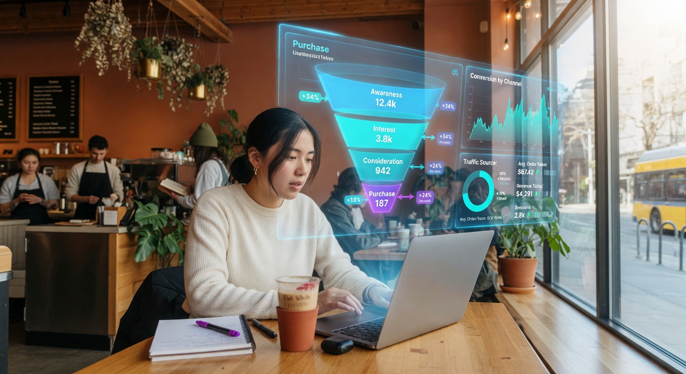
The visitor lands and doesn't know what to do next. There's no guided path from discovery to decision. A funnel is a logical sequence: problem → solution → benefits → social proof → CTA.
Missing funnel: isolated pages, no internal links, no lead magnets, no email sequence.
For more on structuring user experience, see our guide on what a professional SMB website should include in 2026, where we detail the elements every site needs.
Solutions:
- Define a main Journey (e.g., Home → Service X → Case Study → Contact).
- Include lead magnets (free guide, checklist, webinar) to capture emails.
- Nurture sequence via email to educate and convert.
- Reduce friction: short forms, visible phone, live chat if possible.
- Measure each funnel step (Google Analytics 4, events).
Urgent fix checklist
Before you spend more on traffic, review these. Fix what's pending and measure the impact on conversions:
- [ ] Speed: PageSpeed >70 on mobile and desktop
- [ ] Copy: each page has H1 with benefit and short paragraphs
- [ ] CTAs: visible, with action verb, at least 2 per page
- [ ] Social proof: testimonials or cases on each service
- [ ] Mobile: tested on iPhone/Android, no horizontal scroll
- [ ] Menu: max 5 options, clear language
- [ ] Funnel: defined path of at least 3 steps to conversion
- [ ] Analytics: events and conversions properly configured
Copy this list and check off as you fix each item.
Need help optimizing your site?
At BigLobster we run conversion diagnostics and implement the fixes you need. We tell you what's killing your sales and how to fix it, no jargon. Request a free review of your site and get a prioritized plan in 48 hours. To learn how we implement these solutions, check our services page or see our pricing for automation workflows.